There is a point that comes in the career of almost every artist: you’ve made all these works and feel like you are not doing enough to show them off. A strong website is an essential part of marketing yourself as a creator and, with templates that allow you to drag together different website elements visually instead of through coding, Squarespace is often the platform that creative types opt for.
We’ve taken a look at the templates that fit the needs of a range of different artists — from the painter to the musician, from the artist looking to simply show off work to the studio that needs to sell prints or schedule art classes.
Is Squarespace good for artists?
Yes! The combination of beautiful templates and no-web-experience-needed entry point has for years made Squarespace a popular choice for artists who desperately need a website but do not know much about coding or design. A majority of the templates on the site are built primarily with images in mind and make it incredibly easy to show off your painting or drawings. But if you happen to be a sculptor, a musician, or another kind of artist not mentioned on this list, fear not as there is almost certainly already a template for you as well.
Which website features are most important for artists?
While that will depend on what type of work you do and how you want it to look, a few core functions are necessary for anyone looking to draw attention to a creative portfolio. Knowing how many images you’ll want to display, as well as how you want them displayed, will allow you to make a few basic decisions about overall layout. After that, the possibilities are endless so take time to think about what it is you’ll need. While some artists just want to display a portfolio, others will want their site to have a blog, a podcast, or an online store where they can sell their work.
Here are our top picks to get you started.
Classon
Best For Beginner Artists And Simple Websites
Credit: Screenshot:Squarespace
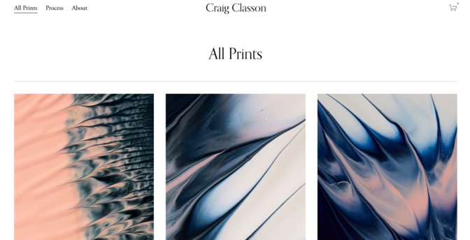
An early favorite among artists looking to build a quick website, Classon has a single-background landing page that you can use to display one of your best pieces. Features such as “All Prints” and “Process” are specifically tailored for artists while the header of the page allows you to feature your name without taking eyes away from your main work. This is not a template with a particularly large number of functions and, perhaps for that reason, it is frequently selected when new artists want to get a website up and running quickly. Simply plug in your work through the drag-and-drop features and play around with rearranging them later.
Alameda
Best For Artists Who Sell Their Work
Credit: Screenshot: Squarespace
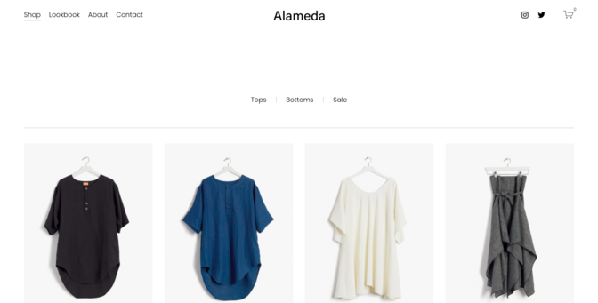
Envisioned for online stores and other forms of e-commerce, Alameda is the template for any artist looking to sell work. Even rectangular icons allow you to lay out different paintings (or whatnot) you have for sale while the text underneath leaves room for titles, descriptions, and prices. Those who click on them are taken to another page with a larger image, more information, and the “Cart” function.
The header leaves room for other pages (“Lookbook” can be used to display a portfolio while the usual “About” and “Contact” features give you a space to describe yourself). While the unique features make Alameda an obvious choice for anyone who sells artwork online, a simple template may be better if displaying work is your primary goal.
Ready
Best For On-demand Artists And Teachers

Credit: Squarespace
Designed specifically for freelancers, Ready offers a clean and simple look for anyone with work to display. The white background becomes an elegant backdrop against a single large image of your choosing while a CTA button allows you to add a scheduling function that will be perfect for those offering everything from art on demand to drawing lessons for children. This template also allows you to include many different pages — a button in the left-hand corner opens onto links to both standard pages like About Us and the more interesting News + Notes and Testimonials.
Wells
For Artsy Types Who Are After A Specific Vibe
Credit: Screenshot: Squarespace
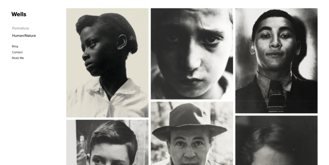
Released in the faraway year of 2012, Wells is a Squarespace old-timer that is often chosen by artists and photographers of all kinds. The right-aligned mosaic alone gives the whole thing a feel of old-school photography but the running stream is particularly useful as it provides a way to display a range of work without overwhelming the visitor.
Along with the usual biography and contact information, you can also divide the site by the type of work that you do or, if you work across multiple media, have pages for anything from drawings to photographs. The overall look is landing-page heavy and fairly basic but, if you have a strong body of work, this template can make it look professional without much effort.
Nolan
Best For Studios, Companies, And Experienced Artists
Credit: Screenshot: Squarespace
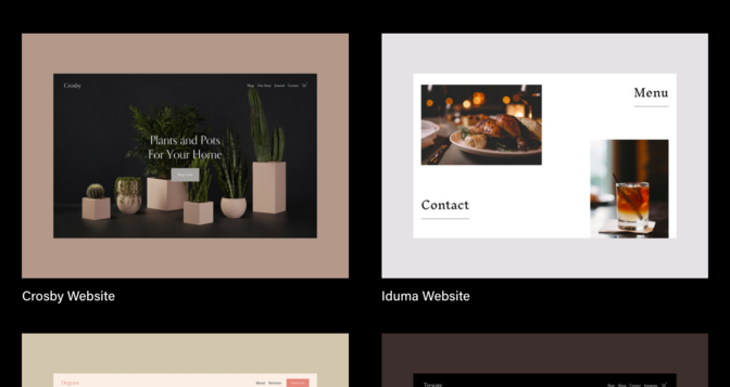
Nolan, a dark-background template that lets you scroll through several full-width image galleries, will work for artists and companies with a more high-end clienele. Underneath the initial image gallery, you will be able to add client logos in between several other case studies. Contact information and services can be seen in both the header and at the bottom of the slider but the projects you choose for the galleries need to speak for themselves as, unlike some of the other templates on this list, there is no opportunity to display a larger portfolio. As a result, Nolan may be a better fit for artists who are already somewhat known in their industry.
Otto
Best For Graphic Designers And Web-based Artists
Credit: Screenshot: Squarespace
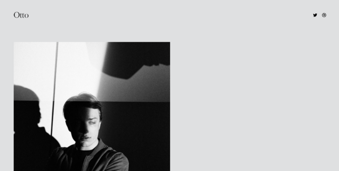
This template is made to look like one large scrolling résumé, a format that has in recent years become popular with many in the art community. Unlike the typical links to one’s biography and contact information you’d expect to find in the header, Otto unravels into a long string of text and photos. Along with the basics of what you do and why people should know your work, you can include anything from case studies and past clients to a string of photographs or drawings.
This type of format will work particularly well for artists who sell their services (for example, graphic designers or portrait creators) but those looking to show off larger bodies of work may find the scrolling function too limiting — more than a few images will make it drag out and crowd out one’s biography and contact information.
Kester
Best For T-shirt, Hand-lettering, And Graphic Print Creators
Credit: Screenshot: Squarespace
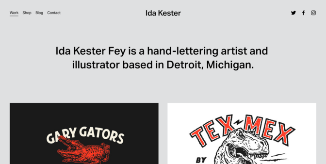
Kester, a template designed by Michigan-based hand-lettering artist Ida Kester Fey, fits the needs of artists who do not fall neatly into parameters such as “painter” or “singer.” A single-color background features square image icons that, when clicked upon, expand for a better view and more information. One of the added features is a shop format, which lets visitors place orders for one’s prints or designs.
The e-commerce format works particularly well for artists who make graphic prints, hand-lettering, t-shirts, or other forms of on-order designs. Those who work for themselves and see their work through the lens of creative inspiration may find the simple design too push-button.
Pazari
Best For Fashion, Photography, And Lifestyle Work
Credit: Screenshot: Squarespace
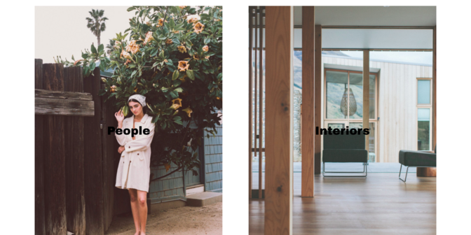
Created by fashion blogger Sofia Pazari, the Pazari template is a great choice for those whose work spans several categories: for example, city, fashion, and lifestyle photographers. The landing page scrolls through a number of rectangular images that, when clicked on, open onto galleries where you can give site visitors more of your work. The white background and large image format are a great way to show off your art in a larger format but, with such a simple design (the background is white while the only other features are Work and Contact in the header) you really need to have a strong body of work to make it look nice. The rectangular icons will also work better for vertical, rather than horizontal, pieces.
Gates
Best For Modern Artists And Artists With Lots Of Work

Credit: Screenshot: Squarespace
A good fit for both artists and photographers, the Gates template stands out with a grid that you can use to display up to 20 images. The whitespace-free grid means that the work you select cannot be too busy but the overall look provides a modern and stylish alternative to some of the more spread-out mosaics selected for displaying a portfolio.
If you also show off your work on social media, you’ll be happy to see icons for Instagram, Twitter, and Facebook in the right-hand corner as well as the chance to link to your contact information. Still, the template’s main feature is the grid. In order to make it look good, be prepared to play around with the arrangement of different types of work — some colors or styles may not necessarily go together.
Kearny
Best For Art Instructors And New Artists

Credit: Screenshot: Squarespae
The basis of the Kearny template was initially a woodworking studio but, with its single-photo landing page and a single button linking to an email, is a great option for anyone who is only starting out in a certain sphere but wants to have an online presence. The template functions, essentially, as an online business card with a photo and a “Contact Me” icon linking to an email.
The limited format works well for small-time entrepreneurs like the art teacher offering at-home classes or the studio launching in a couple of months. This type of site would need to be given individually to those who already know a little bit about you; the lack of an “About Me” page will not be particularly helpful for those who happen to come across you on the web.
Paloma
Best For Musicians And Podcasts
Credit: Screenshot: Squarespace
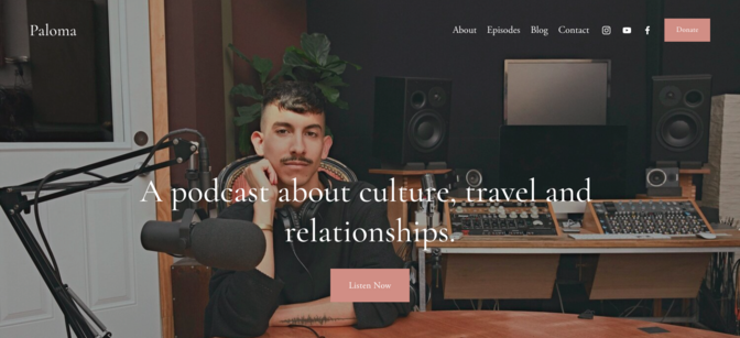
With so much focus on visual artists, many can forget that musicians also need websites. The Paloma template fits such needs perfectly with a built-in player on the landing page and the ability to add podcasts. The Episodes feature allows you to take site visitors to your songs or episodes of a podcast while the Blog page can be used for anything from the simple (announcing concert dates) to the advanced (incorporating videos of performances or adding progress reports) depending on your level of web prowess.
