Musicians are a unique category of artist and, as a result, have unique needs when it comes to building a website. While indispensable to anyone who wants the world to know about their music, features like built-in players and subscription services are not often front of mind for coders and template designers — many of the most popular templates on Squarespace do not have them at all. Building a music-forward website requires thinking beyond appearance and toward what you need your site to do for you. To make that easier, we have lined up a selection of templates that will fit every type of artist, band, DJ producer, or agent out there.
Post Contents
Will Squarespace work for musicians?
It most definitely will. While a quick glance through the templates on the site may leave you feeling like the platform is a better fit for those whose work is more visual than auditory, it only takes one or two music-friendly templates to see just what it can do to help you build a fanbase and promote your music. In fact, many templates are built around features like integrated SoundCloud or the ability to sell tracks and merchandise. If you’d like to test a few options before you start building your website, we recommend searching the site by words like “music” or “DJ” to get a list of templates dedicated to musicians.
Should you opt for a music-specific template? Which features are the most important?
This list includes a combination of templates that are specifically made by and for musicians and those that look stunning and work just as well at showing off your music, even if they’re geared toward something else. It’s worth taking the time to lay out exactly what you want your website to do for your career as a musician: While some just want to make it easy for visitors to listen to as many of their tracks as possible, others need video to show off live performances or fan club capabilities to give dedicated subscribers early access to new releases.
Keep in mind that different features can often be added independently — if you really love the look of a given template, do not immediately discount it if it doesn’t have everything you want.
What is the best Suarespace template for musicians?
We have selected some of the best Squarespace templates for musicians, with something for everyone.
Vandam
Best For Bands And Group Musicians Of All Kinds
Credit: squarespace
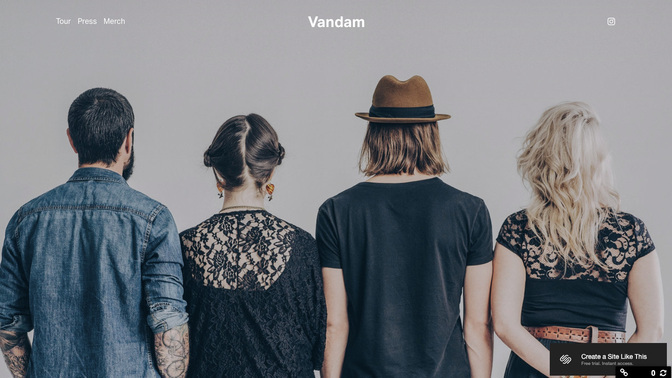
Designed specifically for bands, the Vandam template does not have the usual “about” and “work” sections. Music-specific “merch,” “press,” “tour,” and “home” let you do everything from selling albums and merchandise to letting visitors give your tracks a listen through the template-integrated Soundcloud. The template is easily customisable and lets you add other features that you may realise you need as your band and fan base grow.
The full-width homepage allows you to upload a single photo of multiple artists (but be careful in choosing the right one as, unlike with portfolio landing pages, this is your main chance to draw in visitors) while the press section features a simple blog. Another major perk: a footer section that can be used to display upcoming shows.
Waverly
Best For Individual Artists And Djs
Credit: squarespace
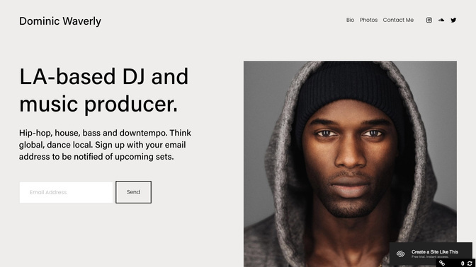
LA-based DJ and hip-hop producer Dominic Waverly created the Waverly template specifically for those who not only create and sell music, but also perform at clubs, bars, and events. The landing page is divided in two parts: one for a photo of the artist (although it can, of course, be used to feature an album cover or anything else) and one for a brief description of your work.
The navigation bar includes pages for your contact information and links to your SoundCloud, Instagram, and Twitter. The scrolling function takes site visitors through blocks of anything you decide to include: tour dates, more photos, and more music in stylish block text. Another trick to make your site look more professional (the one downside to this template is that the design can appear simple if you do not arrange it right) is to use the call-to-action button features to include ways to sign up for newsletters, tour updates, or any other information.
Kitui
Best For Indie And Underground Musicians

Credit: squarespace
Kitui’s landing page is made up of two main image blocks: a primary for the background and a secondary for what users often choose to be an album cover. They are also in black-and-white, which gives the entire site an artsy underground look that can be accented even further with a bright text colour. The landing page design has a single call-to-action button that can be customised to go to something like a soundtrack or a timetable of tour dates.
The image-focused front page allows you to display your latest album front-and-centre while “tour,” “store,” and “contact” buttons in the top left corner provide additional information for site visitors. The overall look is fairly simple and does not allow you to add large amounts of explanatory text — the goal is to keep the focus on your music, which visitors will be able to either listen to through integrated Soundcloud or purchase in the online store.
York
Best For Part-time Musicians, New Artists, Multi-talent Individuals
Credit: squarespace
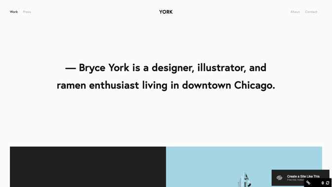
York’s grid landing page is made up of eight rectangular blocks that function just like a portfolio — visitors will be able to scroll through and click on several of your projects at once. This template is fairly simple and not ideal for complex functions; instead, use it to let visitors know that music is one of the things you specialise in. Whether you write songs on the side or are just starting to find yourself in the role of a performer, York can help you start positioning yourself as one. (It may not be specialised enough for those who want to include multiple tracks or integrate too many capabilities.)
Cruz
Best For Eccentric Musicians
Credit: squarespace
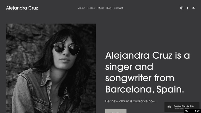
Brought to life by Barcelona-based singer and songwriter Alejandra Cruz, the Cruz template is meant for all the musician “outcasts and misfits” out there. (The black-and-white look alone gives it an artistic aesthetic.) Cruz used the scrolling function to intersperse photos of herself and her albums with her discography and show locations. Somewhat rare for non-portfolio websites, this template also comes with a photo gallery that can be used to showcase photos of past performances. The music feature is great for including multiple tracks from Soundcloud while the blog is essentially a free space for anything you need that was not covered elsewhere.
Paloma
Best For Musicians, Podcasters And Anyone Who Works With Sound
Credit: squarespace
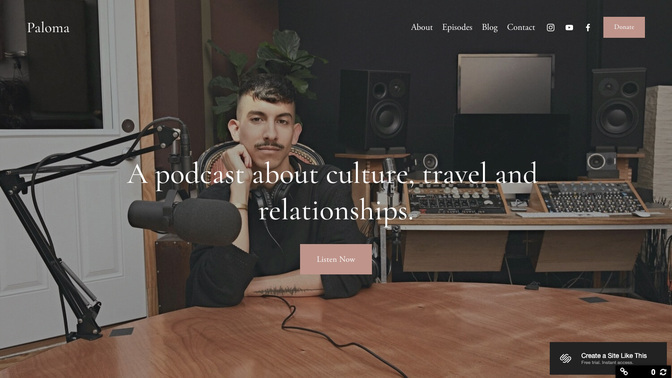
Paloma’s defining feature is the landing page with a built-in player — the “listen now” button minimises the amount of clicking you’ll need to do before getting into great music. Use the episodes feature to create a library of your tunes or podcast clips while all the usual contact information could be included in “about” or “contact.” There is a reason Paloma has been a favourite among anyone working with sound for years: It is both highly customisable and tailored to the specific needs of podcasters and musicians. There is even a “donate” button if your art’s livelihood depends on fans’ generosity.
Aria
Best For Classical Musicians
Credit: squarespace
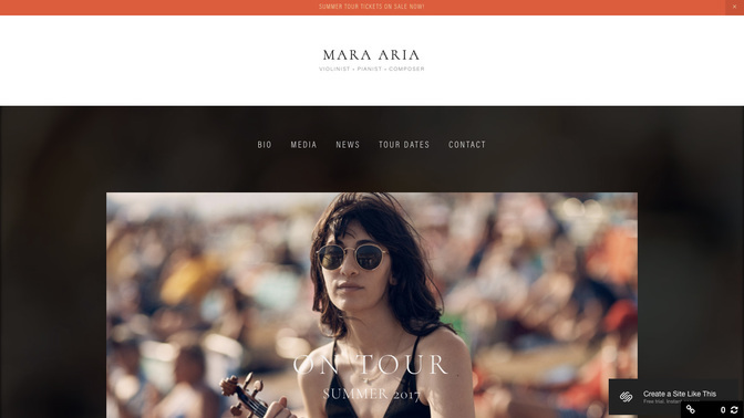
Many of the best music templates on Squarespace have been created by musicians themselves. Violinist Maria Aria designed the Aria template to look clean and professional — a black background accents a single main photo (the template also supports a video background) and links to features like bio, media and tour dates. Aria is part of the original 7.0 Brine family of templates and has the signature scrolling landing page that you can also use to add mini-players of your songs. This is an easy template to launch and add more complex functions later — perfect for musicians who need to quickly build an online presence. “Aria’s cool, composed layout sets the stage for musicians hoping to showcase their work, promote an album, or captivate new audiences,” Squarespace says in its description of this template.
Wav
Best For Producers, Band Managers
Credit: squarespace
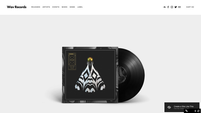
Music fanatics (and early 2000s-era internet users) will know that this template is named after Waveform Audio Format; that alone should let you know that it is made by someone who knows a thing or two about sound. Another Brine family member, it features a modern-looking grid landing page and has buttons for releases, artists, events, and mixes in the header. Like many of the other Brine templates, Wav comes with a high degree of customisability — add a blog, integrate SoundCloud, create a scrolling homepage, and use the eCommerce site to sell tracks, tickets, or band items. A base understanding of website building will allow you to get the most out of all these features; that’s why we recommend it for a band manager or someone who will regularly update and improve the website.
Mercer
Best For Displaying Performance Videos
Credit: squarespace
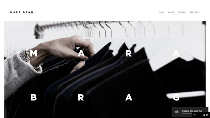
By now, you’re probably noticing a trend that is called the Brine family. The Mercer template has for years been a videographer favourite for its parallax scrolling function: Full-width videos interspersed with explanatory text make your website look high-tech and expensive with only a minimal amount of effort. Musicians can use this template to feature videos of themselves performing — everyone from the pianist to the chorus singer or rock guitarist will appreciate having a video-heavy site. A video background of you playing one of your best pieces will also make a great introduction to anyone who happens to fall upon your site.
