On Sunday, I woke up to a major Facebook redesign.
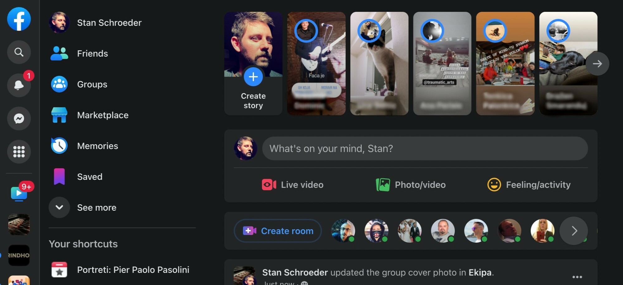
Nearly all of the navigation elements, menus, and settings were moved to the left on the desktop version of the platform, with essentially no navigation on top of the page. I don’t remember whether I opted in for this, but I can’t find a way to roll it back, so this is what the Facebook experience looks like for me right now.

To the left, to the left…
Credit: Stan Schroeder / Mashable
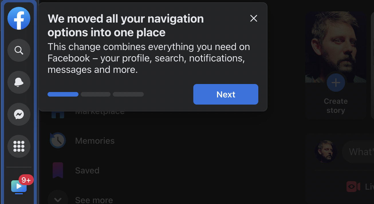
Facebook offered an explanation of what’s new with a brief wizard. “We moved all your navigation options into one place,” it said. “This change combines everything you need on Facebook — your profile, search, notifications, messages, and more.”
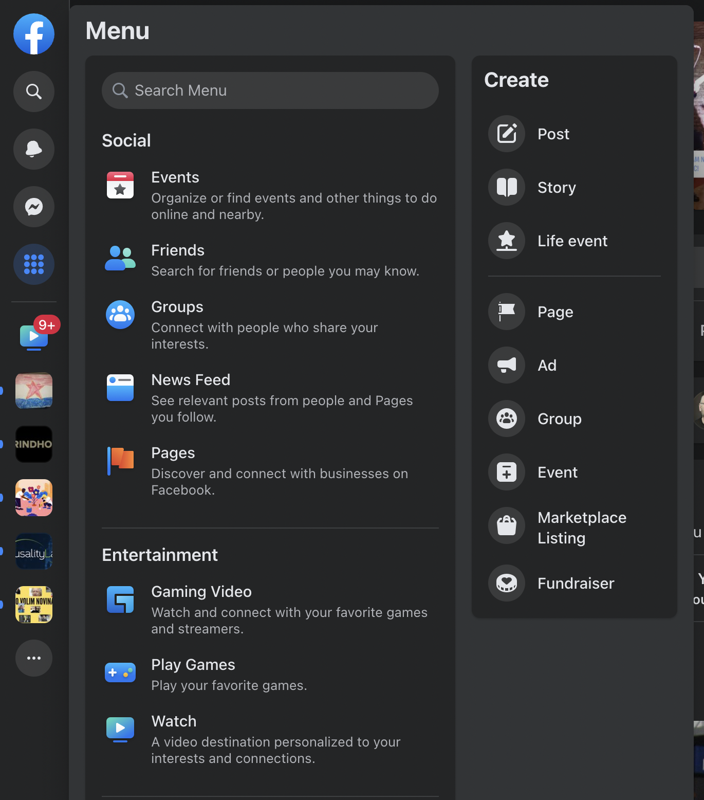
The digital assistant pointed out the 3×3 grid button offering access to a massive “full menu” which appears to contain every Facebook option under the sun. Beneath it, there are shortcuts (in my case, a single shortcut for Facebook’s Watch video offering), and even lower, shortcuts to some of my groups.

The full menu. Good luck finding something quickly in there.
Credit: Stan Schroeder / Mashable
It’s been almost exactly two years since Facebook launched its last major redesign, which included a big change in the site’s navigation, a cleaner look (with nearly none of the company’s favoured blue color to be seen), as well as the optional dark mode. It was a major change, and it took some getting used to, but it was a much-needed overhaul of the over-cluttered Facebook of old.
This new change is disorienting. I use Facebook a lot, and not having that Home button (it’s replaced by the Facebook logo button on the top left) short-circuited my brain every time I needed it. It’s also hard to get used to having absolutely nothing on the top right, where some of the most important features and options (including Notifications and Messenger) previously were.

That’s a lot of buttons.
Credit: Stan Schroeder / Mashable
Every major redesign such as this one requires some adjustment, and everyone will perceive the changes in their own way. However, there are some elements of this design that just don’t seem well thought out. I’m no UI/UX expert, but having two columns of menu buttons on the left, right next to each other, feels like a clumsy, cluttered solution, with so many colorful icons fighting for your attention.
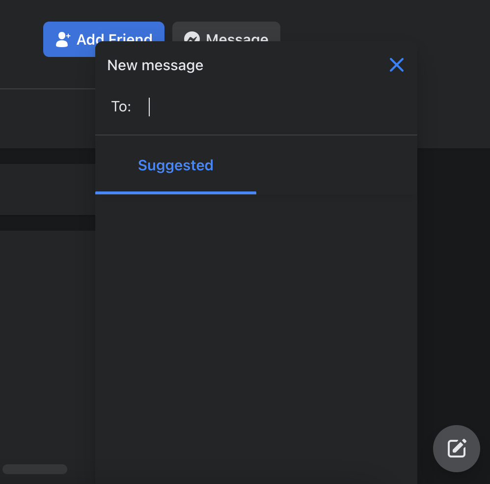
Also, for some reason, one major navigation button — the one for composing a new Message — is left completely alone in the lower right corner. Side note: the Message button composes a new Messenger message, but it appears unfinished at this point, with zero suggestions as to whom I could send something to.

This feels a bit unfinished.
Credit: Stan Schroeder / Mashable
Having most of the navigation and options on the left is commonly seen in web design; Twitter and Gmail both have a similar look. Facebook, however, has a vast amount of options, features, buttons, and shortcuts, and placing all of them on the left might not be the ideal solution.
It’s also worth noting that the new design isn’t even consistent with the design of Facebook’s mobile apps, which have a navigation bar at the bottom, with most features and options available under the “Menu” button in the bottom right.
I couldn’t find any info about this new redesign on the web, and none of my colleagues or friends saw it, so I reckon this is a test aimed at a small subset of Facebook users. I’ve asked Facebook about it, and will update this post when I hear back. For now, can I get my old Facebook back, please?