Google is celebrating 20 years since it launched Google News – yes, 20 years, we couldn’t believe it, either – and to mark the occasion, News was given a much-needed redesign.
The Google News of old was too cluttered and not particularly beautiful. The new Google News has a simplified, two-column design, with most of the navigation residing on top of the page, and it’s a big improvement.
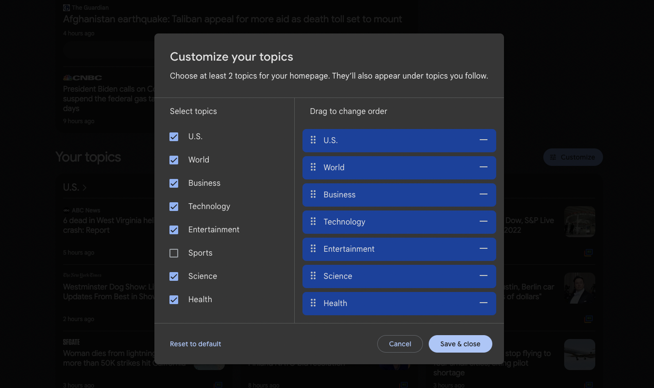
There’s a big focus on customization and personalization. Google’s choice of “top stories” and “picks for you” sit on top of the page; scroll down, and you’ll get a more detailed breakdown of the topics you follow, which you can change by clicking on the “customize” button.

Customization is one click away.
Credit: Google/Stan Schroeder
Google also made local news easier to find; the section now resides in the top menu, among the other news categories. And a quick overview of local weather is squeezed in the top left, beneath the top menu and above the other content; if you want more information, click the little arrow and it will expand to give you a weather overview for the next couple of days.
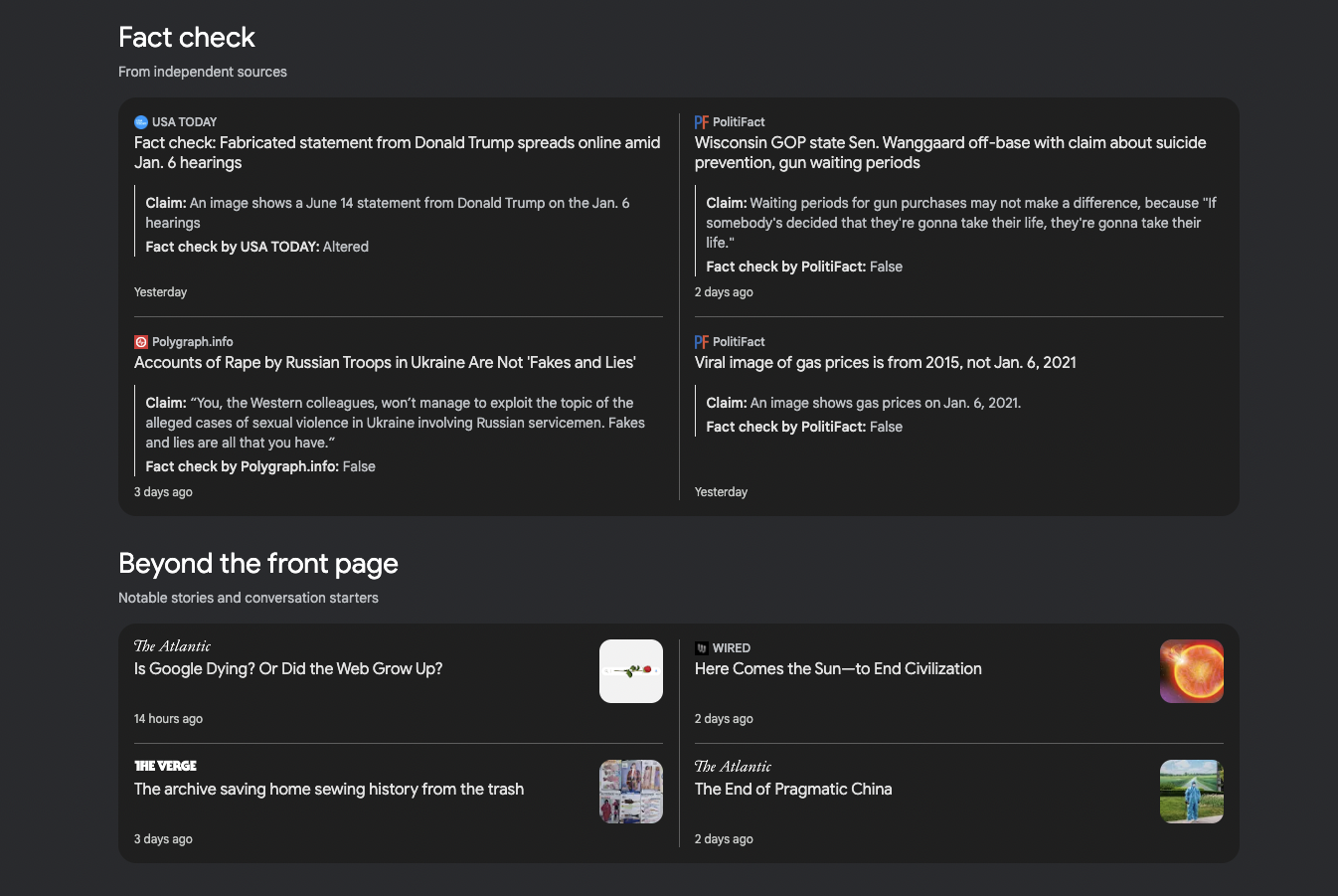
Google has also expanded its Fact Check section, which can be found on the bottom of the main page, and beneath it are stories that Google says are either notable or conversation starters.

This section now shows not only headlines, but also the original claims that were made, along with fact-checked assessment from independent organizations.
Credit: Google/Stan Schroeder
Google News is available in over 125 countries and 40 languages (notably, the service has also returned to Spain, where it has been absent for eight years due to local copyright law). You can check it out over at https://news.google.com/.