For years, the notch just sat there on top of the iPhone, doing nothing besides obscuring the selfie camera and the Face ID components. It was a necessary nuisance, a compromise that afforded a slimmer bezel but not a fully continuous display.
Not any more. With the new iPhone 14 Pro and the iPhone 14 Pro Max, Apple has reduced the notch into a pill-shaped, black cutout on top and gave it life. Apple’s calling it the Dynamic Island, which may be a funny name, but it does convey the gist of it: The notch (now island) is no longer a passive thing that’s only there to hide something; it’s an entirely new feature.
Both the 14 Pro and Pro Max are the same sizes as before (i.e., 6.1 and 6.7 inches, respectively) and their pricing has remained the same: $999 for the Pro and $1,099 for the Pro Max, to start. But they now feature an upgraded display, a new processor, significantly improved cameras, and several completely new features that may actually help save your life.
Post Contents
About that island
Here’s how the Dynamic Island works: When certain apps perform certain types of actions, they show up in the Dynamic Island, which changes shape and gets new traits as it happens.
For example, if you play a song in Apple Music and then minimize the app, it’ll get swallowed by the Dynamic Island, which will then show a tiny icon with the album artwork and an animated music visualization. If you then start a timer, it will be added to the Dynamic Island, which will split into two separate bubbles, each a miniature version of the corresponding app. Touch any of those bubbles, and it’ll launch the appropriate app. Touch and hold a bubble, and the Dynamic Island will grow larger, giving you a quick overview of what the app is doing.
The Dynamic Island isn’t always active. It springs to life when an app is doing something in the background, like playing music, or when the phone wants to notify you of something, such as an incoming call or Face ID unlock. This works for all apps that ping Apple’s NowPlaying or CallKit API, and cannot be disabled or customized.
Apple has integrated the Dynamic Island into the phone’s other functions well. It looks cool, is pretty intuitive, and — most importantly — makes you completely forget that the Dynamic Island is there to hide the selfie camera and Face ID components. It becomes a new feature, something that brings new functionality and is thus almost desirable, instead of being something you’d want to get rid of. It’s never in the way — flip the phone horizontally to watch a video and the Dynamic Island stops being anything other than a small, black cutout.
The Dynamic Island works for any iOS app, not just Apple apps. I tried it out with Spotify and WhatsApp, and the behavior was the same as it was with Apple Music and phone calls. With third-party app support being baked in from the start, app developers will likely flock to take advantage of the new functionality, making the Dynamic Island more…well, dynamic over time. Live Activities, an iOS 16 feature that lets you put widgets on the iPhone’s home screen, is coming later this year and it will also work with the Dynamic Island.
I do have concerns about the Dynamic Island, though. Being on top of the phone, it’s hard to use it with one hand (especially on the 6.7-inch iPhone 14 Pro Max). Also, the constant touching of that area will leave smudges all over your front camera lens. And, as fun as it may be to use, the Dynamic Island is still inactive most of the time, making me wonder whether people will just forget about it after a few days of use.
Still, I have to commend Apple for trying something new here. Essentially, all modern smartphones have some sort of notch or punch-hole cutout for their front cameras, and, until now, none of the smartphone makers thought to turn that area into an interactive feature.
Always-on, but for real
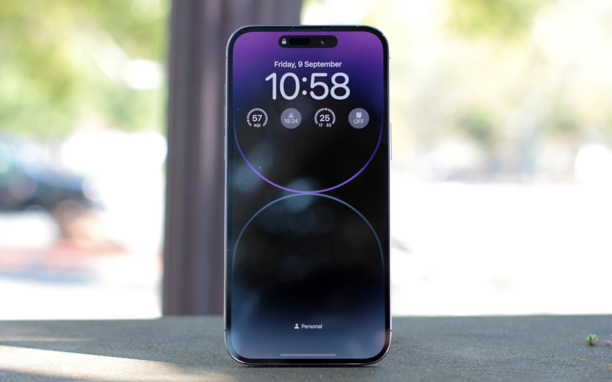
The Dynamic Island isn’t the only big change to the iPhone 14 Pro and Pro Max’s display. For the first time, Apple has introduced an always-on feature, meaning that the display doesn’t just black out when it goes to sleep.
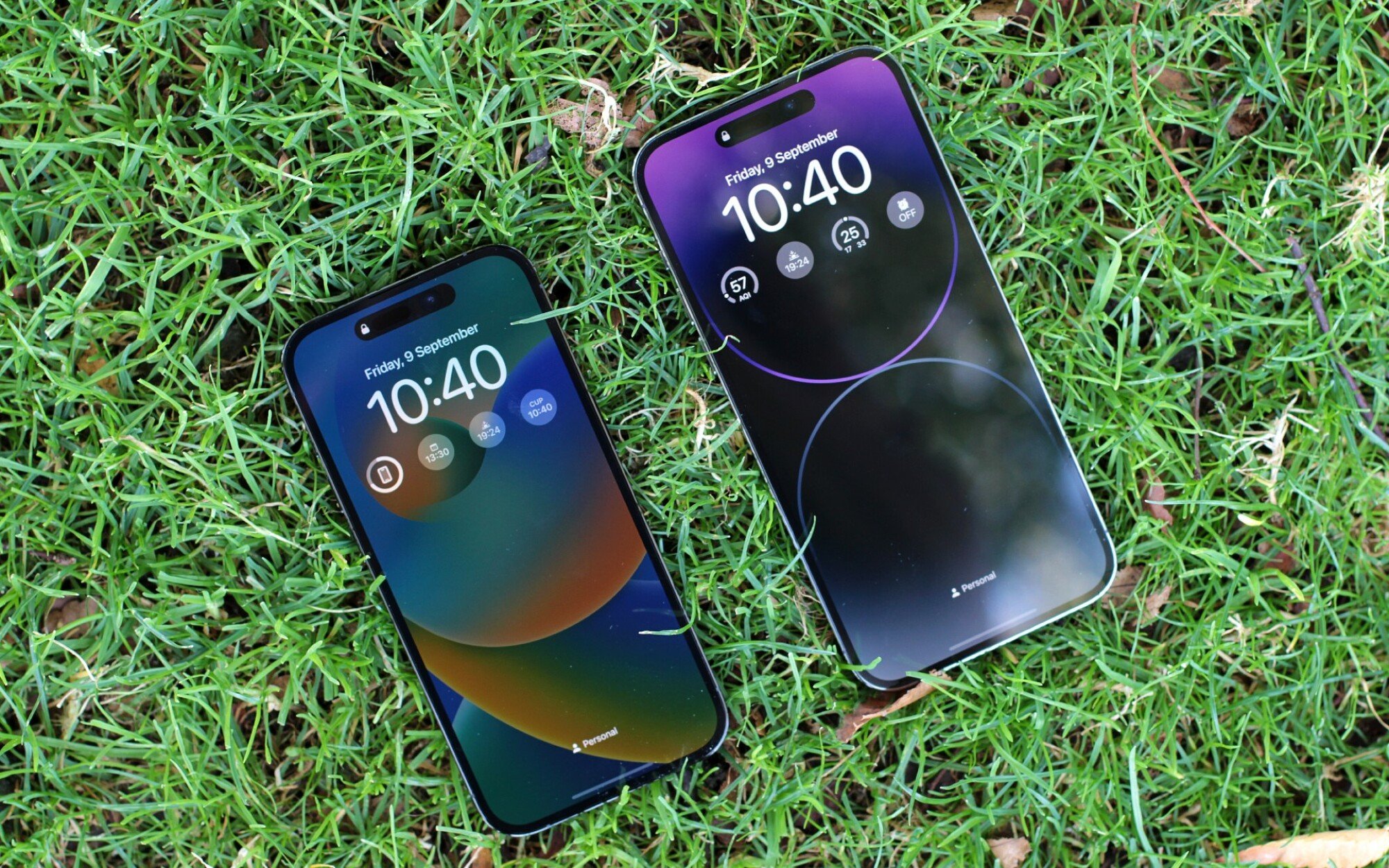
Can you tell that the displays are “asleep”?
Credit: Stan Schroeder / Mashable
Android phones, like the Galaxy S22, have had always-on displays for many years now, but Apple’s implementation is a bit more powerful. Instead of reducing the display to a smaller, simplified version with basic info (i.e., time, date, and weather) and notifications, Apple is giving users a full but dimmer view of their home screen. Your wallpaper, time, date, as well as all of your widgets and currently running apps such as Music, will remain visible when the phone goes to sleep. The display won’t be animated in this state, but it will stay dynamic. For example, if you have music playing and the song changes, this will be visible even when the display is “asleep.”
Apple has made this possible with new screen tech that can reduce the refresh rate to just 1Hz (down from the maximum refresh rate of 120Hz). The display also does turn off fully when you set the phone down on its face or get far away from it (while wearing a connected Apple Watch). All of this is in place so that the always-on feature eats away less battery life. I haven’t had enough time to properly test this, but it didn’t seem like the battery life was significantly worse with the always-on display enabled than without it.
That said, I’m not particularly fond of the always-on display. Having the display constantly on feels intrusive in an odd way. I’m used to the phone screen being black when I set it down on the table and I’m not sure I need it to show me something all the time. Apple’s own Focus modes are there to make sure you don’t spend unwanted time with your phone and a display that’s always on feels almost counterintuitive. However, the feature is easily turned off in the iPhone’s settings, so it’s hard to fault Apple for including it. If you don’t like it, turn it off.
The display of the iPhone 14 Pro and 14 Pro Max is now also brighter than before, as it can achieve a maximum “peak” brightness of 2,000 nits (that’s double the max brightness of the iPhone 13 Pro). I’ve tested the new iPhones against my old iPhone 13 Pro in the bright sun and the 14 Pro was noticeably brighter. But the difference was only there when I had white letters on a black background (one more reason to switch to Dark Mode).
Party in the front, business in the back
The Dynamic Island and the always-on display features make the new iPhone 14 Pro models instantly recognizable from the front, which is important for people who like their new smartphone to look fresh when compared to last year’s version (reader, I am one of these people).
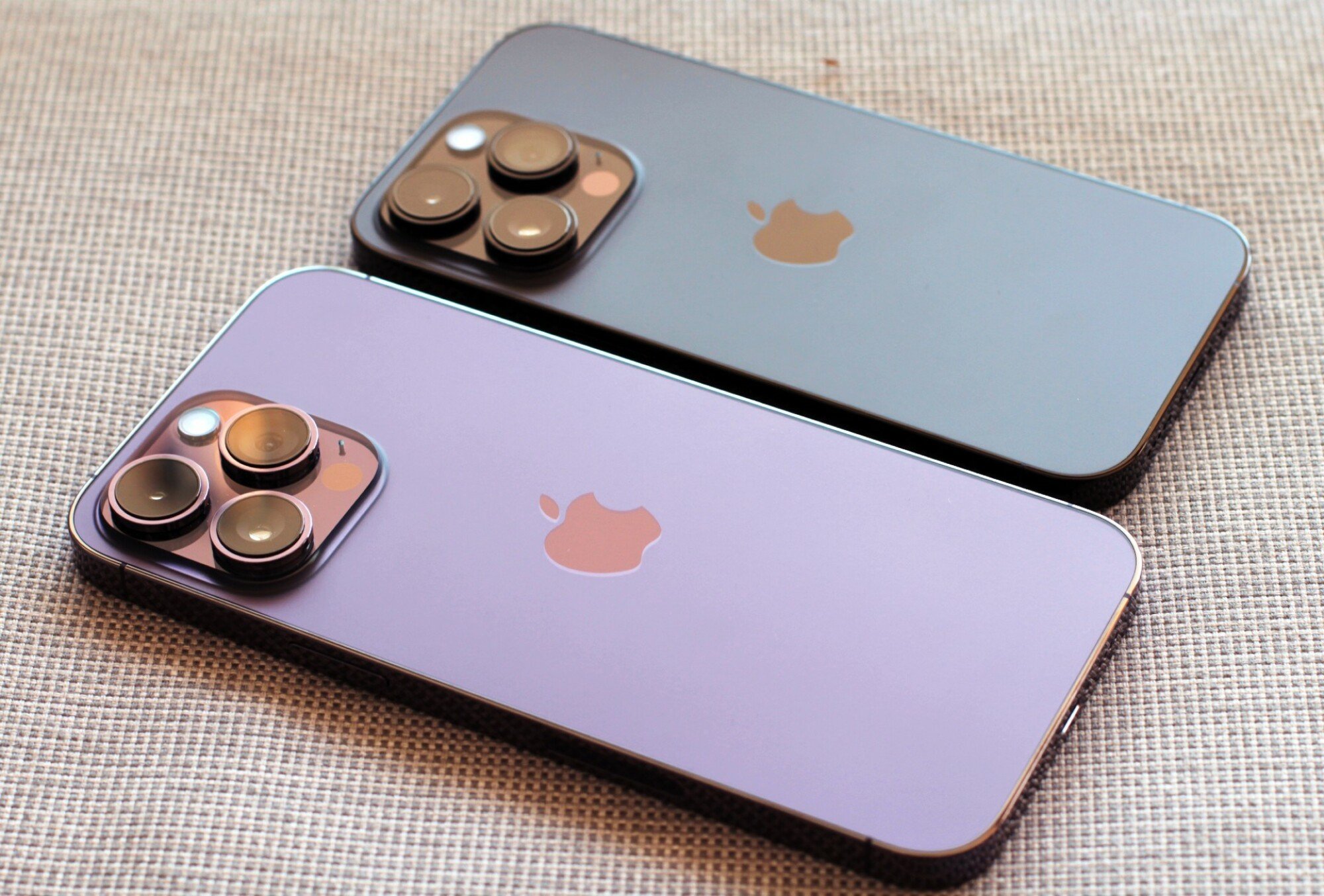
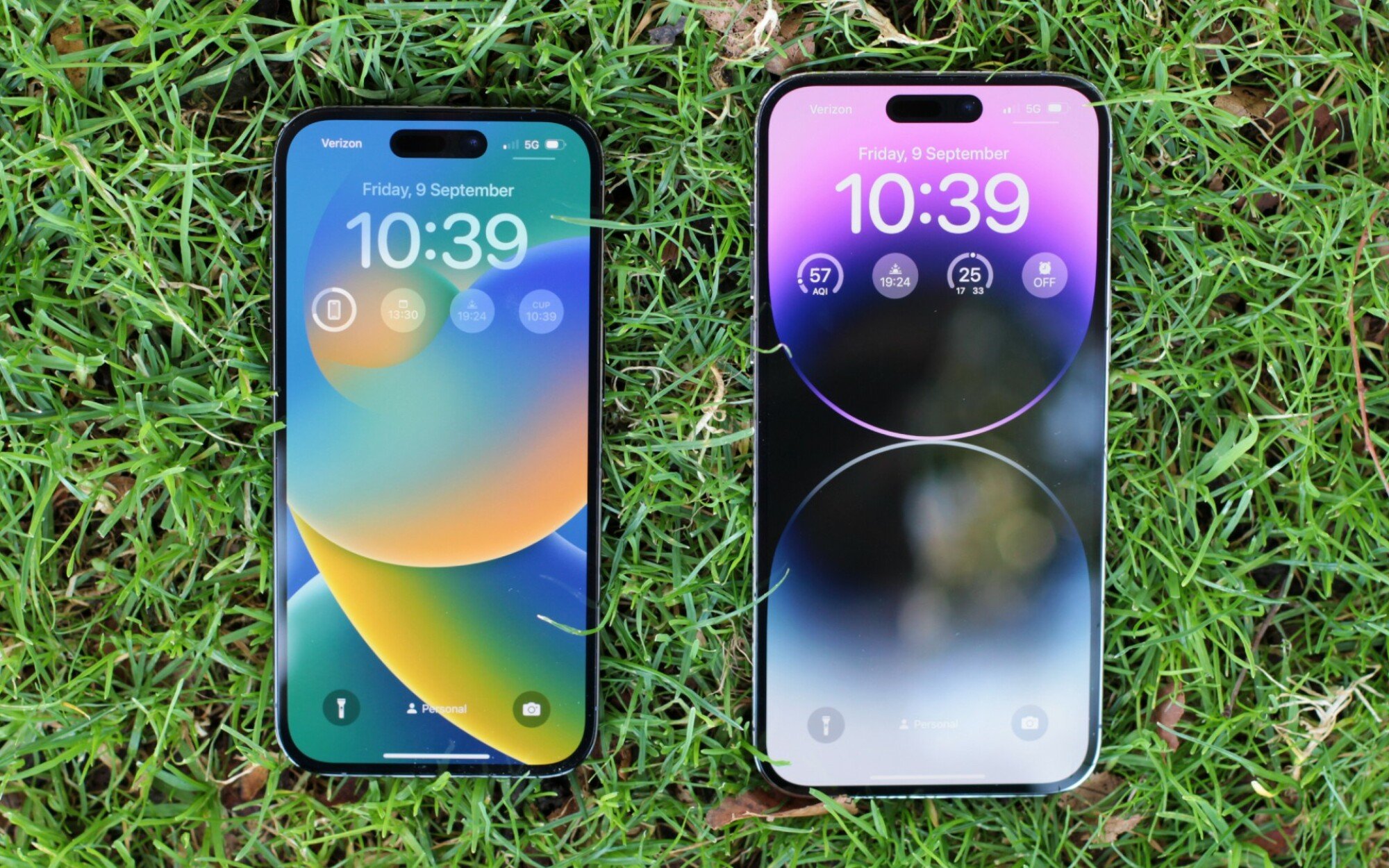
Deep purple and space black. Well, that’s what they’re called, at least.
Credit: Stan Schroeder / Mashable
On the back, the most noticeable change will be the new colors: deep purple, space black, gold, and white. They’re all new — the gold is a little more yellow and the white is whiter than the pearly white of yesteryear. The black version has a truly jet black stainless steel frame and a dark-grey back, and I sense it might be a favorite for many users. The deep purple is nice, but feels a little too subdued, especially in low light. I’d still go for the deep purple, but just know it’s not the flashiest of colors.
Other than that, the new models are roughly the same as last year’s iPhones. They come in two sizes — 6.1 and 6.7 inches — and have a ceramic shield on the front and a stainless steel frame.
I say “roughly” because there are subtle differences. The iPhone 14 Pro is 0.2mm thicker and 0.8mm longer than its predecessor. The camera lenses are a hair larger than before, as is the entire camera bump, but you’ll only notice this with a measuring tape. Bad news: I’ve tried stuffing the iPhone 14 Pro into Apple’s official silicone case for the iPhone 13 Pro, and it didn’t fit. Time to cough up another $49 (or more) for a new case.
Invisible power
Unlike the regular iPhone 14 models, the Pro variants come with Apple’s new A16 Bionic chip. There’s not much to report here in terms of user experience, as you won’t really notice the speed improvements.
Yes, the iPhone 14 Pro and Pro Max feel extremely snappy, but last year’s models are equally as fast. The battery life, while nominally improved, is roughly the same: One and a half days for the iPhone 14 Pro Max during regular (but heavy) usage. On the iPhone 14 Pro, which I spent less time with, I got roughly a day of use.
Bottom line is that Apple’s smartphone chips are so ahead of everything else that you only start noticing slowdowns after a few years of use. For example, my GeekBench CPU score on the iPhone 14 Pro Max was 1,869 for the single-core and 5,461 for the multi-core score, which handily beats all Android devices. It’s nice to have the latest chip, but it’s not really essential.
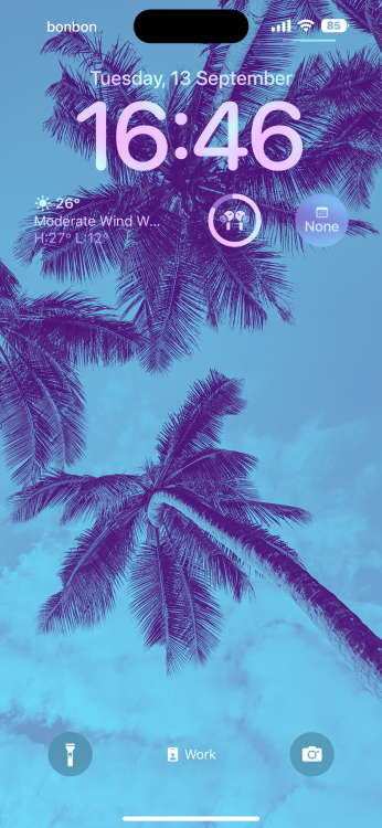
Apple is so fond of the Dynamic Island that it stays there in screenshots.
Credit: Stan Schroeder/Mashable
It’s worth noting, however, that the more powerful chip enables Apple to do more with computational photography and powers many of these phones’ new features, including the 1Hz refresh rate and the smooth animations of the Dynamic Island.
We don’t know how much RAM the new phones have (Apple doesn’t say, but teardowns will tell us as soon as the phones become available to buy), but I never felt like they needed more. Storage starts at 128GB and goes up to 1TB, which is plenty for even the most demanding users.
Megapixels galore
While smartphone makers were racing to cram as many megapixels into their phones’ cameras (Samsung went as high as 108 megapixels), Apple’s iPhones maxed out at 12 megapixels — until now.
The iPhone 14 Pro and 14 Pro Max have a new main rear camera which has a 48-megapixel sensor, the biggest leap since the iPhone 6s, which upped the megapixel count from 8 to 12.
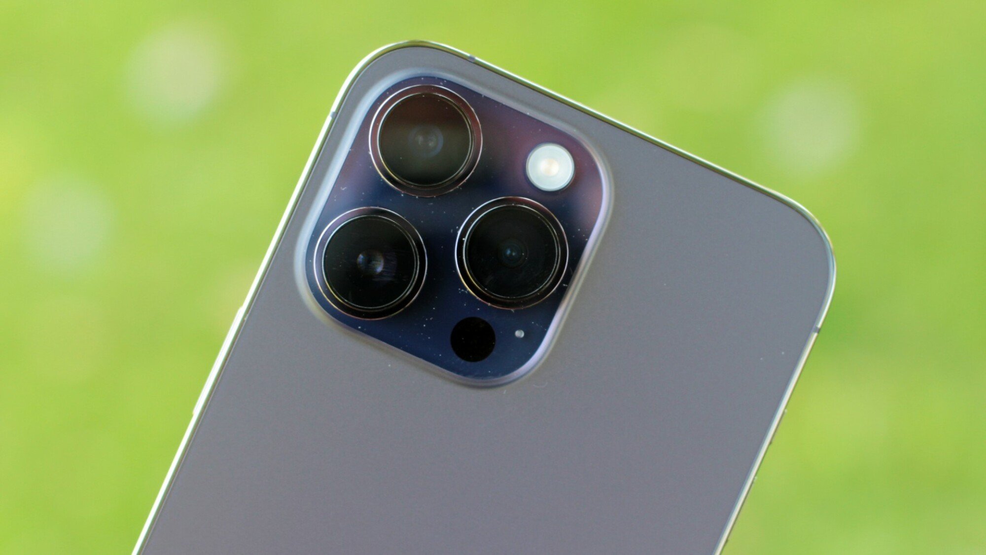
A 48-megapixel camera is a first for the iPhone.
Credit: Stan Schroeder/Mashable
The new sensor allowed Apple to add some cool, new features to the iPhone’s camera. The most obvious one is pixel binning (seen before on other phones like the OnePlus 9 Pro), which combines the information from the 48-megapixel sensor into a 12-megapixel image, allowing for better low-light performance.

I’ve taken the image of this same scene in 12 and 48 megapixels, and the latter photo provided me with more detail without any degradation in quality.
Credit: Stan Schroeder / Mashable
Another obvious advantage is the ability to actually take a photo with a 48-megapixel resolution, which is great when there’s enough light and you want to extract as much detail as you can from a scene.
 Left:
Left:
The 12-megapixel shot gets blocky as you zoom in.
Credit: Stan Schroeder / Mashable
Right:
The 48-megapixel shot of the same scene is far smoother, revealing tons of additional detail.
Credit: Stan Schroeder / Mashable
Megapixels aren’t everything and I’ve often found, on other phones, that maxing out the megapixel count yields a worse photo, as it did on this Xiaomi phone. On the iPhone, there appears to be no degradation in other aspects of image quality when taking a 48-megapixel photo, so you should do it when you really want a top-quality image.

Portrait mode has gotten to the point where it can compare with a real camera.
Credit: Stan Schroeder/Mashable
In Night Mode, however, photos always max out at 12 megapixels. Also note that you can only take 48-megapixel photos in Apple’s ProRAW format. Storing the photo will take a little longer than with regular photos, approximately one to two seconds. Such photos are huge, roughly 75MB in size, and they’ll clog up your phone’s storage fast.
It took just a second to get this sharp, detailed image with vibrant colors.
Credit: Stan Schroeder/Mashable
The iPhone 14 Pro also has improved zoom, though maybe not in the ways you’d think. While the last year’s Pro models only let you choose between 1x and 3x zoom, the new ones add a 2x option. This is essentially a digital crop-out from the larger, 48-megapixel image, and it works pretty well. For real optical zoom, switch to 3x, though you’ll hardly tell the difference between digital and optical. Bottom line is that zooming in works quite well and you’ll get good results at any magnification.

The zoom works, though figuring how much of it is real and how much is digital can be tricky. You can even go to 15x, as I did here, and get a decent photo.
Credit: Stan Schroeder/Mashable
The big benefits of the new cameras, according to Apple, should be in low-light photography, not only because of the 48-megapixel sensor, but also due to the Photonic Engine which — as far as I can tell — repurposes Apple’s Deep Fusion AI, only reworked and applied a lot earlier in image processing than before.
 Left:
Left:
This scene would be tough to crack for any phone because the lighting was very warm. The iPhone 13 Pro tried to make the image whiter than it should’ve been, but otherwise produced a good image.
Credit: Stan Schroeder / Mashable
Right:
The iPhone 14 Pro Max performed admirably, preserving the colors accurately.
Credit: Stan Schroeder / Mashable
However, in actual usage, the benefits were minor, at least when compared to the iPhone 13 Pro. Colors were a little more accurate in low light and you could occasionally get some more details from certain scenes but, more often than not, I was able to get a similarly good low-light photo from last year’s iPhone. That’s not to say that the iPhone 14 Pro and Pro Max’s low-light performance is bad; it’s just not as improved as Apple’s promo materials would want you to believe.
 Left:
Left:
The iPhone 13 Pro’s photo leans yellow, but it’s otherwise pretty good.
Credit: Stan Schroeder / Mashable
Right:
The iPhone 14 Pro Max’s photo has far more accurate colors and is sharper, but it’s noisier. It wins, but only by a hair.
Credit: Stan Schroeder / Mashable
The cameras have a cool new video feature called Action Mode. It’s basically image stabilization tuned for extreme situations, such as running, when the picture would normally be bouncing all over the place. I’ve tested it out on the iPhone 14 Pro Max and, curiously enough, turning it on made little difference, not because the Action Mode did nothing, but because the iPhone applies quite a bit of image stabilization during regular video capture.
I gave it another try, taking things to the extreme this time, moving my hand up and down frantically, and the difference was more pronounced. The resulting videos were not as good as having a pro-grade gimbal, but still good enough to turn your action shots into something watchable.

Selfies were sharp, with tons of detail. In bad light, they tend to lean red, though.
Credit: Stan Schroeder/Mashable
The selfie camera has also benefited from the Photonic Engine tech. It takes great selfies during the day that are sharp and detailed. In low light, it’s not overly aggressive in trying to make the subject matter brighter, producing more accurate, but slightly darker images than you’d get on the previous generation iPhone.
Life-saving features
All of Apple’s new iPhone 14 models come with two features that are peculiar simply because you won’t ever want to use them, but you’ll be happy they’re there.
One is Crash Detection, which uses the iPhone’s various sensors to detect whether you’ve been in a car crash and, if so, it lets you dial 911 or can automatically do it for you if you’re incapacitated.
Obviously, I hope I never get to test it, but it’s a good feature to have and something that people with kids who are old enough to drive will likely consider when getting them a new phone. A cool thing about this one is that it’s available worldwide.
The other is Emergency SOS, which is interesting both for its practical aspects and the tech innovation that made it possible. It allows you to send an emergency message when there are no cell towers around and you have absolutely no reception. You do this by going through a short setup process with questions about the nature of your emergency and then pointing the phone towards the sky to find a satellite.
Going out camping? The new iPhone could come in handy, even when there’s no reception.
Credit: Stan Schroeder/Mashable
After the iPhone launch event in Cupertino, Apple set up a test near Apple Park for me to try this and it worked well, only taking a few seconds for me to lock the satellite in and send the SOS. The test was set up beneath parasols, which didn’t cause problems with reception at all, meaning that light foliage above you would probably also be fine.
Of course, beaming a signal to a satellite from a canyon will be tough. Using a phone when severely injured would probably be tough as well. But it’s better than nothing when you get lost in the wilderness without water, for example. The feature also allows you to beam your location to friends or family, which is great for mountaineers and people who like to camp or hike in the wilderness.
It was cool to be able to communicate to a satellite with a regular phone, with no need for a special antenna. The scope of usage may be narrow right now, but it opens up the possibility for other features, such as using satellites for sending actual messages to friends in the future.
The fine print
The iPhone 14 line has quite a few new features and changes you won’t notice at first glance. For example, the Pro models now have dual ambient light sensors — one on the front, and one on the back — which should further improve how the phone’s display behaves in various types of light. I took the 14 Pro and the 13 Pro in my hands, held them against bright light, and then turned away and went into a dark room, and the 14 Pro was more responsive in adapting the display’s brightness.
The gyroscope and accelerometer sensors in the phones were also upgraded, which should help with the Crash Detection feature, but might also be useful in other ways which I haven’t found yet.
The display resolution on the 14 Pro and the 14 Pro Max was slightly increased, too, but there’s no way you’ll tell the difference. The iPhone 13 Pro has a 2,532 x 1,170 pixel resolution, while the 14 Pro has a 2,556 x 1,179 pixel resolution. The Pro Max has a similar increase in pixels, too. Also, the 14 Pro is two grams heavier than the old model.
One thing that the new iPhones do not have, at least in the U.S., is a physical SIM slot. It’s all about eSIM these days, which might take some getting used to. I set up a U.S. version of the phone with an eSIM and it went without a hitch. Apple also gave me a European market-bound phone to play with and that one had a standard, physical SIM card, which also worked normally.
It should also be mentioned that the all of the iPhones still have Apple’s proprietary Lightning connector. It’s 2022 and it feels weird, given that pretty much everyone else — even Apple itself on its other devices — has switched to USB-C. There’s nothing wrong with Lightning, but I’d really love to have just one set of cables for all my devices.
It’s time to go Pro
These days, smartphones don’t change much from version to version. And often we’ve seen Android smartphone makers innovate, with Apple coming in late. With the Dynamic Island, Apple has turned one of the most annoying traits of modern phones — the visible front-facing camera — into a cool, new feature that you’ll actually want to have. The jury is still out on whether people will actively use the Dynamic Island or whether it’ll be just another widget on your screen, but I gotta hand it to Apple for innovating where other smartphone makers did not.
A worthy upgrade.
Credit: Stan Schroeder/Mashable
Equally as innovative are Crash Detection and the Emergency SOS features. In a way, these could be life-or-death features, and it says a lot about Apple’s certainty into the robustness of its tech to launch these widely on its most popular devices.
Other new features, including the always-on display and the 48-megapixel camera, could easily be dismissed as stuff that competing phones have had for years, but Apple has tweaked things enough for these to be noteworthy.
As far as downsides go, I can’t really think of any that don’t apply to the previous generation of iPhones. Unless you really love the notch or need to have the physical SIM slot, the new Pro models have been improved in enough ways to matter, and they even have a snazzy, new look courtesy of the Dynamic Island.
It seems the Apple of old is back and innovating again. Finally, a new iPhone that’s worth the upgrade.